
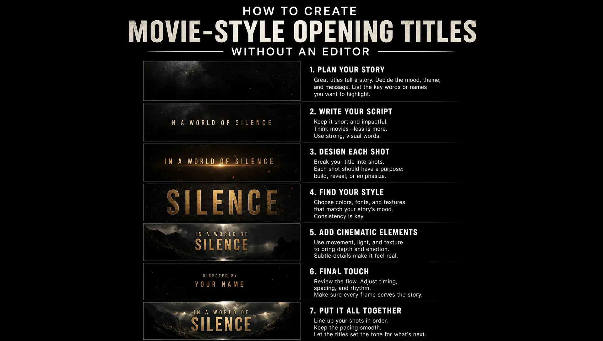
A cinematic-looking opening title used to require a motion designer, a compositing timeline, and a real understanding of typography, lighting, and pacing before a single second of footage played. That skill set hasn't disappeared, but it's no longer the only path to a title card that reads as intentional rather than default. What's changed is that a text description can now do a meaningful part of what a designer's hand used to do, generating a styled title directly rather than requiring frame-by-frame compositing to get there.
This isn't a substitute for a professional motion designer on a project that has one. It's what's actually available to a project that doesn't.
Why a title card is a harder design problem than it looks
A title card has to do two things simultaneously that pull in different directions: establish a mood visually, and keep the actual text, a film's name, a chapter heading, a channel's identity, perfectly legible while it does. A background that's too busy undermines the second job even while succeeding at the first. This tension is why professional title design has historically been treated as its own specialty rather than something folded into general editing work.
Generating a title without a compositing tool doesn't remove that tension, it just moves where the decisions get made, from manual layout and timing to how specifically the initial description is written.
Describe the typography as specifically as the visual mood
A vague prompt like "a cool title for my film" gives a generator almost nothing to differentiate on, which is exactly why so much AI-generated typography defaults to the same handful of generic looks. The typographic character that actually reads as intentional, a specific era's lettering style, a particular weight and spacing, a texture on the letters themselves, needs to be named directly rather than implied by a mood word.
The same principle that makes a product or character reference work applies here: specific input gives a generator something concrete to reproduce, while vague input produces its best statistical guess at "title card," which tends to look like every other AI-generated title card for the same reason.
Build the visual mood before locking the final version
A title card's background, lighting, and color language matter as much as its typography, and testing that direction cheaply before committing to a final version is worth doing deliberately rather than accepting the first result. Generating a few concept variations, different lighting moods, different color treatments, and picking the one that actually earns its place ahead of the rest of the project is a faster and cheaper version of what a designer's mood-board process used to accomplish manually.
This step is easy to skip when a generator makes it fast to get to something that looks finished, but a fast first result and the right result aren't the same thing.
Match the title's identity to the rest of the project, not just itself
A title card generated in isolation, without reference to what it's introducing, risks looking like a strong design that happens to sit in front of an unrelated video rather than a genuine opening for it. The strongest version of a movie-style title shares a visual language, color, mood, camera treatment, with the content that follows, so it reads as the beginning of one connected thing rather than a separate graphic bolted onto the front. This is especially useful for UGC creators who need their branded video content to maintain a consistent visual identity from the opening frame onward.
invideo agent is built around this specific connection: because a project's characters, locations, and visual style are held in a persistent context engine, a title sequence generated inside that same project shares that established identity automatically, rather than needing to be manually matched to it afterward. The platform routes that generation to whichever of its 200+ integrated models fits the intended look, including Veo 3.1, Sora 2, Kling 3.0, Seedance 2.0, Runway, PixVerse, Hailuo, WAN, Recraft, GPT Image 2.0, and Nano Banana, and Camera Controls let a director apply a deliberate move, a slow reveal, a push through an environment, as the title plays over it.
Treat legibility as a hard constraint, not a style preference
It's easy to prioritize how a title card looks over whether its text is actually readable at a glance, especially once a strong visual concept exists. A title that photographs beautifully but blends into its background, or uses a typeface that's more decorative than legible, fails at the one job a title card can't skip. Checking legibility specifically, not just overall impression, before finalizing a design catches this before it becomes the version that ships.
This matters more for text that has to convey specific information, a film's actual title, a name, a date, than for purely atmospheric text where some illegibility is an acceptable stylistic choice.
Common mistakes when generating movie-style titles without an editor
Describing the mood but not the typography. A vague style description produces generic-looking type, since specificity about lettering, weight, and texture is what actually differentiates one title card from another.
Committing to the first generated result instead of testing a few directions. A fast result and the right result aren't the same thing, and comparing a few concept variations before finalizing catches this cheaply.
Generating the title in isolation from the rest of the project. A title card that doesn't share the following content's visual language reads as a separate graphic rather than a genuine opening for it.
Prioritizing visual impact over legibility. A beautiful title card that's hard to actually read at a glance fails the one job it can't skip.
Assuming a generated title automatically fits the project's pacing. Text timing and how long a title needs to stay on screen to actually be read are still decisions that need deliberate attention, not just visual generation.
Conclusion
A movie-style opening title no longer requires a motion design department to look intentional, but it does still require the same underlying discipline a designer would bring to the problem: specific typographic direction instead of a vague mood word, a few tested visual concepts instead of the first result, a deliberate connection to the project the title is introducing, and legibility checked as its own non-negotiable requirement rather than assumed. The tools have changed what's achievable without a specialist. They haven't changed what actually makes a title card work.
For a project generating its opening inside the same pipeline as the rest of its footage, that connection can happen automatically rather than as a separate matching step, which is the difference between a title card that reads as a strong, disconnected graphic and one that genuinely opens the film that follows it.